
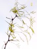
"field.trees"
Lisa post from yesterday or so - I never understood the dateline in the Pacific. Earlier later - California is later.
Pure PhotoShop until I reduced file size to show here.
The pic inspired me - from moment I saw it. I work with spring and then with fall. Like being a jet setter. But, this image looks like older work with new tool - nothing inspired. File size is better, larger. I can drive PS a bit now in reverse I guess.....
Past, imperfect, but promising, getting a glimpse of tool set and learning to flatten out. Cautious George working quicker.


12 comments:
wow wow flashy - like that pink -
like your perceptions. like your blog.
lol
I wish people would leave the delete facility because quite often I need it.
While I am making the tea and thinking about it, my better amended comment is
Quite the jet setter, Mocow yeterday, New York today. lol
Hot pink papa. Candy to the eyes, inspiration to this collagist :)
sizzling and cool at the same time. i love this color combo. more please.
89 degrees in norcal today. we's dyin. send ice.
Grasshopper, learning. Wax on, wax off. Very interesting, color combo it is quite lovely and vibrant.
I like seeing these progressional images.
Not as hot here in SoCal, sending cool, coastal winds to NorCal.
I am very fond of the middle image, not that attracted to the other two which have no meaning to me, other than that they are very pink.
The middle one is enough of a challenge to be very pleasant to look at and very unusual in the choice of colors for the subject, but in a good way.
I like the brightness of it and feel the intimidation of the unnatural colors on the natural landscape, which is a nice push.
With these kinds of paints, I expect all sorts of excitement in the future. There will be no boundaries to your imagination now.
Will there be any swirling?
Haha Hot Pink Papa!! Nice one Neda!
I like the clash of the bottom one softened by cand floss cloud...
home.spun.
Oppsy, like the clarity of the top pic, the see-through stained glass windows...almost heavenly.
So pleased you were inspired:)
Nora, I swirled once when I lost MS Paint and first got paint.net.
Will hide a a swirl somewhere soon for you, maybe.
Thanks, everyone. I appreciate your visits.
Pink, pink, and more pink. I like :) Must be all this female influence. lol!
I must get back to ps myself. Too much going on for me. I'm having a hard time keeping up.
What I would give to be a fly (or a very quiet monkey) on the wall while you work.
I love both pink versions: the top one for its playful depth and the bottom one for its playful rhythm. They both are outrageous, in a good way.
Post a Comment