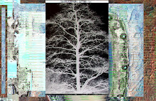
"for.kappa.1"
The Altered Page left a comment atop a flap.jack and I found his blog and I enjoyed photos and content....go here.. There are some excellent shots of NYC art he took on the street. Explore. Excellent site and he truly appreciates what NYC has to offer, what most cannot appreciate.
Page includes a photo of a painting that was spectacular. When I saw the painting "Kappa,1" at MOMA at least two months back, it was the painting "in the room" that I wanted to take home. I always like to pick one thing in each room that I would take home. I try to stay with what was most amazing rather than what I would have to look at the rest of my life.
A truly great painting makes me laugh with joy. Happens less often with music, something that I also need a daily dose of.
Somehow I needed to continue work - seduced by color and here is where I went.....

In the end, I added Andrea's backyard tree and a snippets of a mandala from the artist formerly known as Sweet Irene - Nora. Not a great image, but experimenting.

"early.morning.mist"
A circuitous route to comment on how I had wanted to do something with less color, minimal. With a U-Turn. Like chasing a sun dress in the rain.


7 comments:
i so appreciate your process and your compassion.
both make my heart.ache
~sue
You know that spells SIN, don't you?
my metaphor? i kannot spel
I could easily steal your first work..
minimalistic perfection ...and I so love black...
round up your friends John and get them to come on over to my blog and vote for YOUR fantastic work !!!
ps...the poll will be up for a week ;)
Like the snails leaving their trail through my garden,devouring along the way.
The end result, magnificent minimalism.
P.S. you got my vote over at Kim's
black - nice. I saw a black painting at a Russian exhibition recently.
I like that kappa 1 - reminds me of some paintings I saw pretty recently of views through curtains/blinds or something. Gave an added dimension. Also looks like yours, straining to see what lies behind.
lacy gold curlicues - interesting, reminds me of rococoness. Still quite a bit of colour, but not so hot in pink. cool breezes.
It cannot succeed in actual fact, that is exactly what I think.
Parksville apartments
Post a Comment