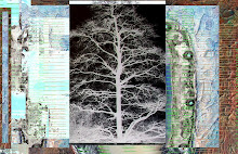
"apple.white.berry"
Back to the apple. Back to Beatles records and to iPods. Get back.
This image I noticed on my blackberry on the commuter train - image is an example, below. But now flipped on its back, cropped and with a slight sun tan. Long Island Rail Road revelation while sitting backwards and going forward.
Bubbles, air trapped forever. Probably toxic - maybe a trace of lead. No, the bubbles are happy thoughts in a little blog.toon.
Last draft, which I still like, possibly better - not sure if bottom is distracting or makes the image more complex. What do you think?


7 comments:
The bottom doesn't distract, it adds to the texture. I do enjoy the circular shape showing on the right side. The subtlety of the color, combined with the texture, reminds me of the moon's surface. I also like the patchwork quality of your work.
I like to put my ipod on shuffle while painting, because I am constantly surprised. Ipod makes a twisted DJ; yesterday's set included the Beatles, Bjork, Dean Martin, Clash, Buckethead, Mariza. It all works!
Not sure about the bottom.. Might work. The design is a little bit "heavy" on the lower left corner. Still works though. All this reminds me of champagne.
Now, if I only I could figure out the phone book in my Blackberry. Grr!
It remind me of the moon..
A new territory waiting to be explored.
operation.desert.storm? I personally like more detailed and complex images and get frustrated looking at something so empty of detail as my eyes search from one spot to another to focus on. I also like more color, but then I am baroque in my tastes. It is possible that I don't understand what you are trying to achieve here. I always want to know something about what I am looking at.I hope you don't mind me making these remarks, as I am usually very positive about what I have seen so far. Call me the "Lone Critic."
I appreciate every comment and want both positive and negative constructive feedback.
Neda, I do agree the bottom left is heavy - done as a counterweight to eye moving down and to the right. Bottom right elements take you off the page (which can be fine - there are rules and part of art comes from acknowledging them and then breaking them). With hindsight I should have edited there, not just cropped. Great catch, and done with grace and kindness. Something I lack,too often, I know.
Irene, I now see the "desert storm" reference, both in terms of bomb craters and maybe - yes -camouflage . This is more minimal and plain image and I think I became seduced by the black berry discovery. Sort of a second hand "mini me" manipulation of a process part.
I was not so sure about it so I asked for opinion and suggestions (always acceptable, please, even when not explicit).
I am amazed by those here that put out solid work daily or close to daily. When I first got here - meaning communicating with others, inspired by others - I had a rush of creativity. I do feel in a rut now and some of what I post will be missing teeth, maybe have an over bite.
I have never known what is allowed in blogs - what is considered "kosher" re critiquing. On the one hand it is always great to encourage, but that has to be tinged greatly with credibility. I do appreciate kind honesty.
OK - so I take two steps forward one step back....good enough for a enhancing a savings account.
And art is more important than that, some days....Thank you.
You know, John, you are a better man than I am :) Asking for what others see is a leap of faith for both creator and "reader."
At first, I was churning out posts everyday, drunk on the endless possibilities. Then. Crash. Afterwards, I found balance. But it is hard for obsessive compulsive artistic types. like me.
You have landed in a unique crowd: art and camaraderie. We are the ones who are lucky to have you among us :)
I was serious about the BB. Please help (I hate their website!)
I agree with Lisa It reminds to the moon, If I could I woul travel to the moon once
Post a Comment