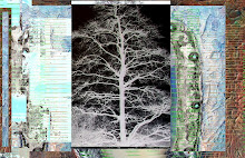
I feel like I am looking through a window in an aquarium with this work John... the purple makes a sensational contrast to the aquatic blue...green and gold .... lol 'scaling back'...I got it !!!
I like both of these images for different reasons. I love the cobalt teal and purple with the azo gold gives it a nice patina. I like seeing more of the fish image in.a.barrel.two the lightness of the center makes the outside pop in color and intensifies the border.
and I like the overall neon intensity of in.a. barrel.
I need to catch up with a lot of these posts. I love fish *2 for the illumination as I like the age of enlightenment. I a sure Da Vinci would have picked them also for their grace of movement, all caught in a different pose. Or was that Michaelangelo? I forget...
This website contains copyrighted material including but not limited to text, graphics, and photographs. The entire contents of this website (except Lyrics and photographs attributed to others ) are copyrighted as a "collected work" under the United States copyright laws. Permission to modify the altered images or photographs or to use any image for commercial purpose must be negotiated with me in advance. Thank you.


9 comments:
I feel like I am looking through a window in an aquarium with this work John...
the purple makes a sensational contrast to the aquatic blue...green and gold ....
lol 'scaling back'...I got it !!!
back to school
I like the illuminated version John...
your PR rank is showing as 3 on my Google toolbar ;)
i like the fish in the mystery school...but that's just my frame of mind these days...
I like both of these images for different reasons. I love the cobalt teal and purple with the azo gold gives it a nice patina. I like seeing more of the fish image in.a.barrel.two the lightness of the center makes the outside pop in color and intensifies the border.
and I like the overall neon intensity of in.a. barrel.
Nice work.
my kitties like it, too.
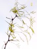
Thank you. I seem to be going back to my fish shots.
I do not photograph much. Will try to some this weekend. Need fodder.
Also need to load PhotoShop and learn to drive a stick shift.
I need to catch up with a lot of these posts. I love fish *2 for the illumination as I like the age of enlightenment. I a sure Da Vinci would have picked them also for their grace of movement, all caught in a different pose. Or was that Michaelangelo? I forget...
Hi John,
I like this first one quite a bit!! I like the detail much more on the first.
~ Diane Clancy
www.DianeClancy.com/blog
www.YourArtMarketing.com
Post a Comment